


Wedding Styling & Decoration: Guide + Real Wedding Breakdown
Saved hundreds of decor photos but still unsure what fits together? This wedding styling guide helps you choose a concept, prioritize zones, and create a consistent look - based on a real wedding example.


WEDDING DATE - Wedding planning guide
Choosing the perfect wedding date can shape your entire celebration. In this guide, Midsummer Events explains what to consider—from venue availability and seasonality to guest comfort and personal meaning. Explore trending dates for 2026 – 2027 and learn how to pick the day that truly reflects your love story.


Planning Your Dream Destination Wedding in Malaysia
Wedding Resorts in Malaysia: Top 5 Venues for Your Big Day


Creating the Perfect Wedding Mood Board: Top Tips
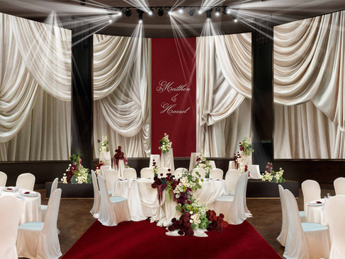
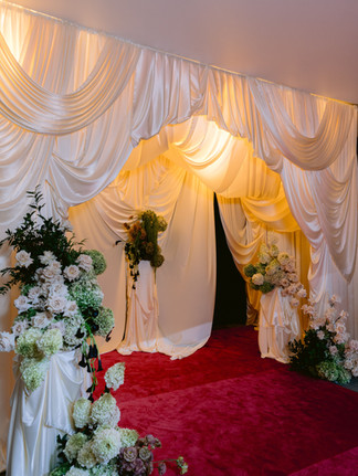
Planning a wedding can feel like trying to catch a cloud. So many ideas, so many styles, and a million tiny details to consider. How do...


Plan Your Destination Wedding in Malaysia from Abroad
Wedding planner Midsummer Events Kuala Lumpur Can You Plan a Malaysia Destination Wedding from Overseas? Absolutely! At Midsummer Events, we’ve spent the last 8 years planning weddings across Malaysia for couples from around the world — including the UK, Australia, Canada, the US, Singapore, and Hong Kong. Many of our clients are in mixed marriages or Malaysian by origin but based overseas, and they want to host a meaningful celebration back home. We've successfully planned


Top 5 Unique Wedding Venues in Malaysia
Malaysia offers an array of extraordinary wedding venues, each with its own distinctive charm and character.


Where to get married in Malaysia?
In this article we will share with you where you can get married in Malaysia. Couples can now select from a range of options.


Wedding trends that we love
Wedding trends


Ready to Nail Your Wedding Planning? Our step-by-step Wedding Planning pipeline is here for you.
Having a step-by-step wedding planning pipeline can be incredibly helpful in keeping you organized and on track throughout the process.


Intimate wedding in Malaysia – Let’s make it memorable.
Let’s talk about an ideal intimate weddings, also known as micro-weddings or mini-weddings today.


Comments